![]()
This is the print version of this page. All content is copyright Indezine.com 2000-2026.
![]()
Info-things on PowerPoint usage including tips, techniques and tutorials.
See Also:
PowerPoint and Presenting Notes
PowerPoint and Presenting Glossary
Most PowerPoint designers love to have white space on their slides, but there will always be demands from clients to include more and more content. Now, this is not a great idea because slides need to be aesthetic and focused–and adding so much more textual or any other content negates the very idea of well-designed slides. Adding extra content is, therefore, a compromise that you should avoid.
In the real world, there will be many reasons to cram this content, and the immediate result is that designers have to use a font size that’s smaller than what they started with. But really speaking, what is the smallest font size that you can use?
Filed Under:
Guidelines
Tagged as: Font Size, Fonts, Guidelines, PowerPoint, Slide Design, Text
Comments Off on Smallest Font Size for PowerPoint Slides
For the last 20 years, users have waited for 3D in PowerPoint. There were umpteen add-ins (small programs that plug into PowerPoint, much like Photoshop and WordPress plug-ins) that added 3D models, 3D backgrounds, and even 3D text in PowerPoint. They met the same fate–discontinued by their vendors! And that’s sad because some of them were really awesome and ahead of their time.
And now Microsoft has announced that there will finally be real 3D in PowerPoint. How is that different than the other add-ins? And does this mean that you can really do 3D modeling in PowerPoint? Here are the answers to those questions:
Filed Under:
Showcase
Tagged as: 3D, Heather Alekson, Microsoft Office, PowerPoint
Trend Micro released a comprehensive blog post that talks about a trojan horse malware triggered by PowerPoint’s Mouse-Over action setting. This action setting can run a PowerPoint macro.
OK, this is not as bad as it may sound. Why? I can think of three good reasons:
Filed Under:
Troubleshooting
Tagged as: PowerPoint's Mouseover Malware
Comments Off on PowerPoint’s Mouseover Malware Trojan Horse
Once you insert a chart in PowerPoint, you may find that you mixed up the series and categories! It’s easy to switch between both of them by clicking the Switch Row/Column button on the Chart Tools Design tab of the Ribbon–but wait, do you see the Switch Row/Column button grayed out, as shown highlighted in red within the screenshot below?
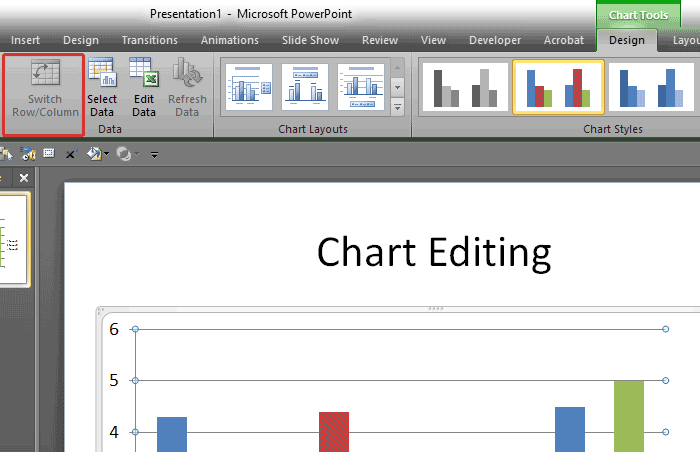
The solution is simple, although not so apparent. All you need to do is to right-click the chart on your slide to bring up the contextual menu, shown below. Now select the Edit Data option.
Filed Under:
Troubleshooting
Tagged as: Charts, PowerPoint, Switch Row/Column Grayed
Comments Off on Switch Row/Column Grayed Out for a Chart in PowerPoint?
We finally explore the seventh timeline example in our series on different timelines that stand apart because they are unique.
This timeline is from our friends at Presenter Media, a Sioux Falls, South Dakota-based organization. My contact at Presenter Media was Art Holden.

So what do we like about this timeline? We love the fact that the curve makes this timeline fit in more timeline stops in a smaller area. Plus, the current timeline stop shows up larger and gets more attention than the stops that denote earlier times.
Presenter Media calls this timeline the Navigate Timeline. This particular timeline includes several extras within the timeline presentation you download from their site.


Template Link | Aspect Ratio: Standard (4:3) and Widescreen (16:9). Apple Keynote variant also available.
If you have found a timeline template that’s different than others, do let us know by adding a comment. Also, if you are a vendor who wants their templates to be featured as part of this series, do get in touch with us via our feedback form.
See More Timelines that are Different: 01 | 02 | 03 | 04 | 05 | 06 | 07
Filed Under:
Showcase
Tagged as: Art Holden, Presenter Media, Review, Sample Slides, Templates, Timelines
Comments Off on Timelines that are Different – 07
Microsoft and the Office logo are trademarks or registered trademarks of Microsoft Corporation in the United States and/or other countries.