
 (16 votes, average: 4.50 out of 5)
By Puneet Gogia
If you are a project manager then I’m sure you agree with me on this:
For a project manager, one of the most important things is to track the progress of the project.
Type “Yes” in the comment section, if you agree.
Well, there are a lot of charts and templates which you can use to track your projects, but one of my favorites is the Gantt Chart, which is also one of the popular charts. And if you are an aspiring project manager then it’s important for you to learn to create a Gantt chart in PowerPoint.
Here’s the thing, creating a chart directly in PowerPoint gives you an edge that you can present it anytime without any hassle.
So today, to help you with this, I’ll be sharing a step by step process to create a Gantt chart in PowerPoint.
What is a Gantt Chart?
A Gantt chart is a bar chart where each bar represents the start and end schedule of one phase of the entire project. In simple words, the entire chart is made of bars for each phase of the project showing the starting and ending date. It was named after Henry Gantt, who created it in 1910.
Before we dive deep into the Gantt chart, make sure to download this free e-book, 10 Tips for Cool PowerPoint Charts + latest PowerPoint tips and tricks directly into your inbox.
Benefits of the using a Gantt Chart
As I said, the Gantt Chart is one of the most used charts for project managers and it has some benefits:
1. Clear Picture of the Project
In a Gantt chart, you can track all the phases of a project and their time of completion, which helps you get a clear picture of the entire project. You how many phases are complete, the running phase, and the pending phases.
2. Help to Manage Time
With a clear picture of the project, you can manage your time in a proper way. So if you know that some phases of the project took more time then expected, or the running phase in consuming more time, you can plan for the rest of the phases accordingly.
3. Help to Communicate Effectively
Once you have a clear picture of your project and you know where you need to put extra efforts and you can communicate it clearly to your team or all the people who are involved in the project.
Things You Need to Create a Gantt Chart in PowerPoint
Before you create your own Gantt chart you need to know how a typical Gantt chart looks like and what are the major components that you require to create it.
- Dates: To track every project you need to have dates and for the Gantt chart you need to have a start date and end date of each step/phase of the project so that you can plot each phase on the chart with accuracy.
- Phase Name: It’s important to have the proper name for all the project phases so that you can identify which is the first and which is last and use them in the chart.
- Duration Days: This is the difference between the start date and the end date of a phase. It tells you how many days each phase took to complete which is the major component to analyze.
Steps to Create a Gantt Chart in PowerPoint from Scratch
At this point, you are pretty sure about what a Gantt chart is, why it’s so helpful, and you know there’s a huge benefit of creating a Gantt chart in PowerPoint, so it’s time for action now, let’s create your first Gantt chart on PPT slide.
Follow the below steps to create a Gantt Chart in PowerPoint:
- First of all, make sure to have a clean and clear slide so that you can have enough space to create your chart. This can be easily achieved by selecting the Home tab | Layout option. Next, choose wither the Blank or the Title only options.

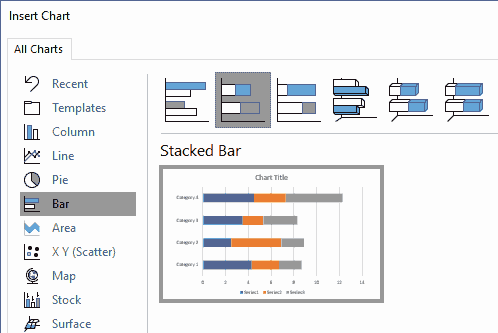
Start with a clean and clear slide- Now, access the Insert tab on the Ribbon, and click the Chart button. In the resultant Insert Chart dialog box, choose the Stacked Bar Chart option.
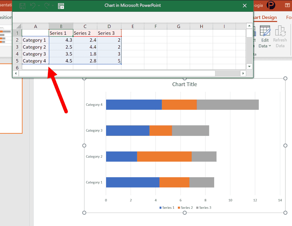
Insert a Stacked Bar Chart- Once you click on the chart to insert it, it gives you a new stacked bar chart and an Excel window with a sample data set where you can paste your original data.
Excel window with a sample data set- From here you need to prepare the data format to enter the data for the Gantt chart. The first column is for Tasks, then the next two columns for start date and end date, and the last column is for duration days.

Prepare the data format to enter the data for the Gantt chart- In the Tasks column, you need to enter all the tasks’ names, and start and date of each task in the start date and end date columns, and in the duration days, you need to enter a formula to calculate days between the start date and end date (=C2-B2).

Enter data in the spreadsheet for the Gantt chart- And make sure to format dates from both of the columns in a way so that you can show them in a chart without any problem. For this, you need to select both of the columns and open the format option and from the number tab, select the date format as I have selected in the example.

Change format of dates to present them in the chart in a right way- At this point, your data is ready and you need to make some tweaks in the stacked bar chart to convert it into a Gantt chart. So first of all, you need to open the chart filters and from the chart filter un-tick the end date series (don’t forget to click on the apply button).

Remove end date column from chart series- After removing the end date from the chart series, your chart will look something like this.

Chart after removing end date- Now if you look closely, in the chart which you have in your slide right now has two different bars.

Now the chart has two different bars- Here you need to format the first bar. You need to apply no fill to it. For this select the bar and open the format data series options (Double click on the bar). After that open the fill and line option and apply the no fill option.

Apply no fill to the first bar- At this moment you have a chart like below but the next you need to customize its axis to get the right range of the dates.
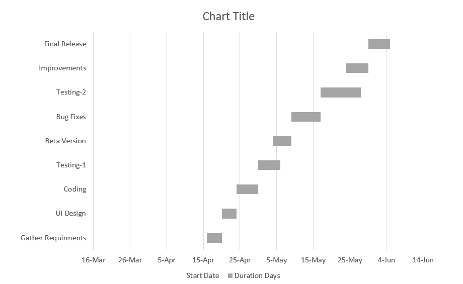
Chart with only duration bars- So double click on the axis to open the Format Axis options and after that go to Axis Options | Axis Options. Here, enter the starting date of the project (we have 16-Apr-2019) and hit Enter.

Correct the date range for the chart axis- The moment you enter the date it changes the starting date of the chart and now your chart looks something like this, there’s still one this which you need to do.
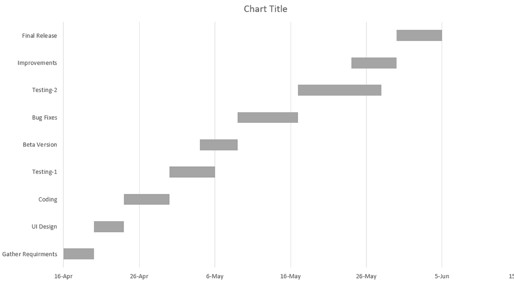
Chart with the first date of the project- So now, you double click on the vertical axis to open the Format Axis options and after that go to Axis Options | Axis Options. Here, tick mark the Categories in reverse order option.

Apply Categories in reverse order
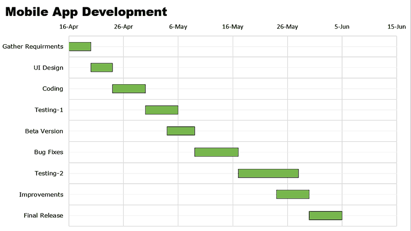
Now, your Gantt chart is complete. You can also add some formatting to it like I have marked red all those project phases which are late and rest all green and I have also added the project name to the chart title.
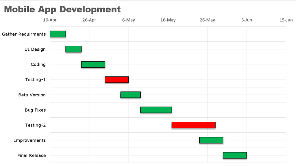
Final Gantt chart in PowerPoint
Adding a Gantt Chart in PowerPoint from Excel
The steps which you have learned in the above section of this post are the same steps that you need to follow to create a Gantt chart in Excel.
So even if you like to create a Gantt chart in Excel, you can do so. But let me make you one more step smarter from here, below I have a code that you can use to copy your existing chart from Excel worksheet to a new PowerPoint slide.
You just need to select the chart which you have in your worksheet and run this code from the macros
Sub ChartXL2PP()
Dim PowerPointApp As Object
Dim myPresentation As Object
Dim mySlide As Object
Dim myShape As Object
If ActiveChart Is Nothing Then
MsgBox "Hey, please select a chart first."
Exit Sub
End If
If PowerPointApp Is Nothing Then _
Set PowerPointApp = CreateObject(class:="PowerPoint.Application")
On Error GoTo 0
Application.ScreenUpdating = False
Set myPresentation = PowerPointApp.Presentations.Add
Set mySlide = myPresentation.Slides.Add(1, 11) '11 = ppLayoutTitleOnly
ActiveChart.ChartArea.Copy
mySlide.Shapes.Paste
Set myShape = mySlide.Shapes(mySlide.Shapes.Count)
myShape.Left = 200
myShape.Top = 200
PowerPointApp.Visible = True
PowerPointApp.Activate
Application.CutCopyMode = False
End Sub

Puneet Gogia is the Co-Founder of Excel Champs and a spreadsheets expert. Through his blog, he has helped thousands of people to understand the power of spreadsheets. You can find him online, tweeting about Excel, on a running track, or sometimes hiking up a mountain.
The views and opinions expressed in this blog are those of the authors and do not necessarily reflect the official policy or position of any other agency, organization, employer or company.